



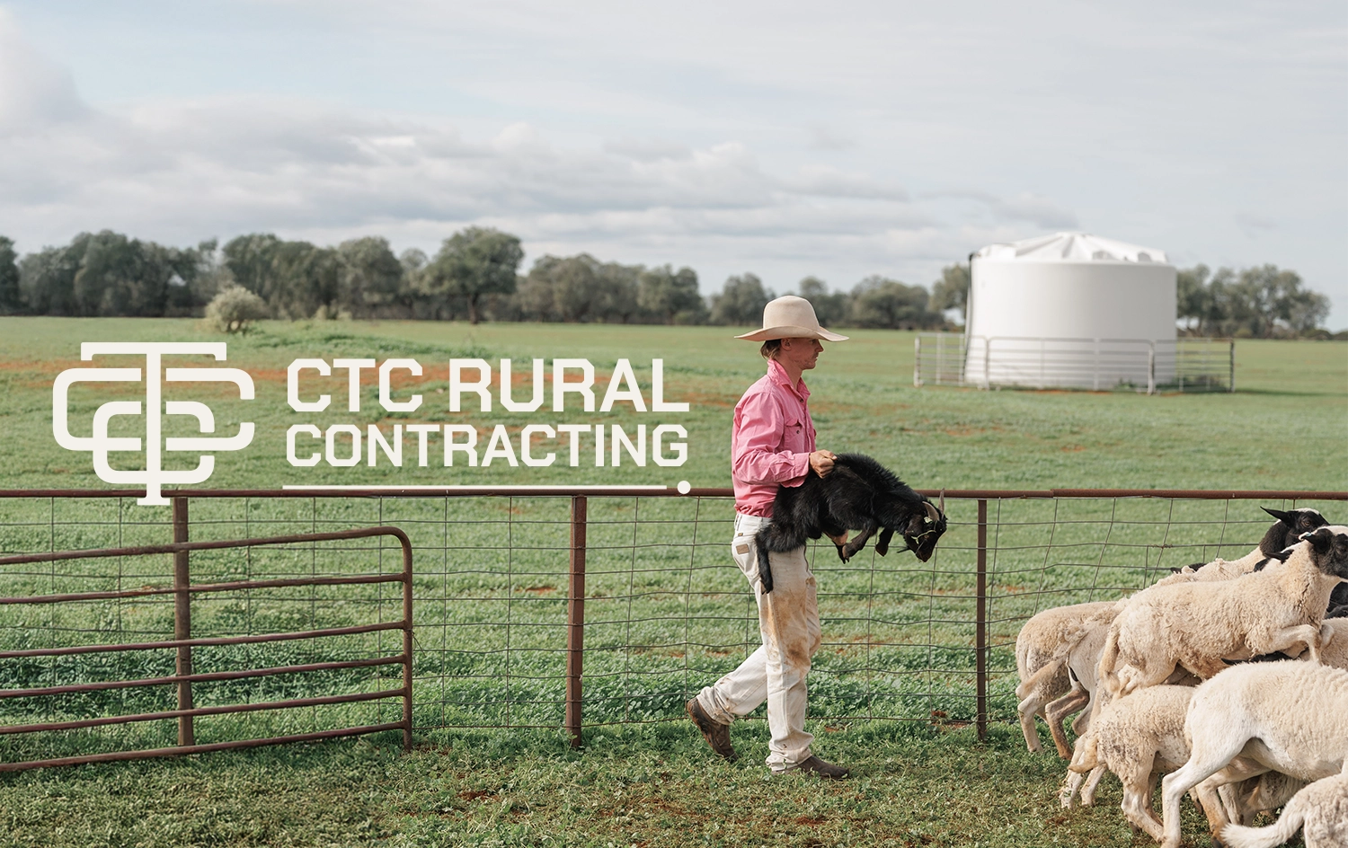
CTC Rural Contracting musters goats, cattle, and sheep across western NSW. A contracting brand rarely gets read up close, it's on a cap across a yard, a shirt in a race, a ute door three gates away, so the mark had to work at distance before it worked as a wordmark.
In a region full of contractors, being recognised matters as much as being good. The brief was a brand that holds up in dust and glare, and still looks like it belongs to the country it works in.
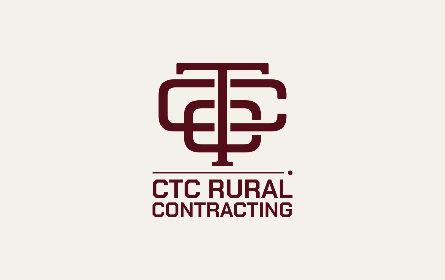


Most branding is designed to be seen from a page or a screen, but this one needed to work in the opposite way, to be spotted at a glance, across a yard, with beer goggles on.
It also had to stand out. When a producer's deciding who to call for a muster, being remembered is half the job.
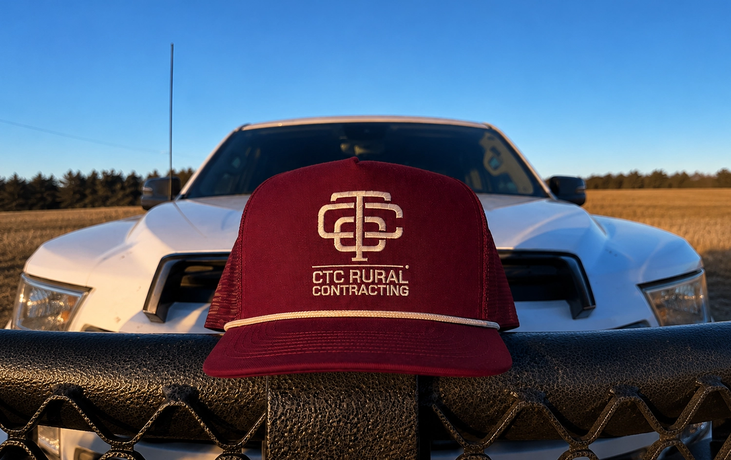
A monogram that works bloody hard.
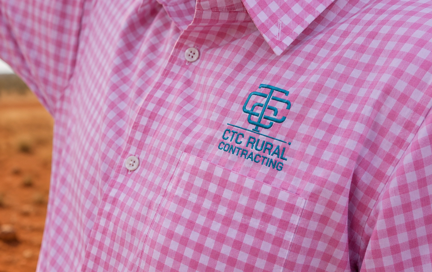
The core of it is an interlocking monogram, three letters built into one solid, symmetrical badge, so it reads as a shape before anyone's close enough to read the letters. Bold and blocky enough to hold up embroidered, printed, or laser-cut onto a gate.
Heavy, condensed type carries the wordmark alongside it, built for durability rather than delicacy, plain-spoken the way the business is.
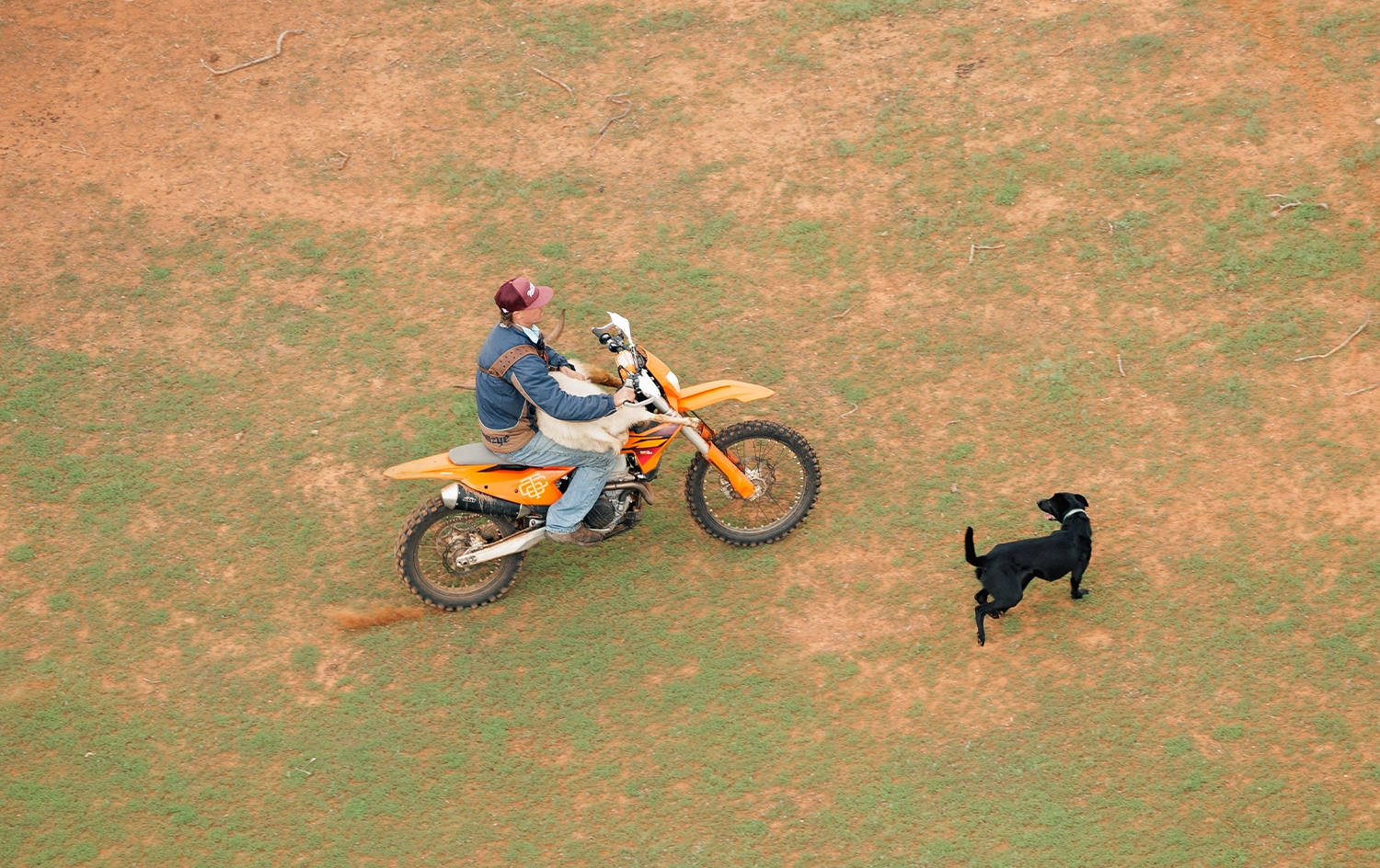
CTC now has a full identity across a working colour set, deep burgundy, black, white, and a working blue, so there's a version that reads on any shirt, cap, or background it lands on.
A brand that looks like the operation behind it, solid, capable, and hard to miss.




Marketing for Rural Australia