




Boundary Agency partnered with Pene Keynes to build a brand that does one thing well: gets the message received, wherever it lands.
Pene consults from the boardroom to the back paddock, so the brand had to hold up in both. Too corporate, and it dies at the farm gate. Too much agricultural cliché, and it loses the room full of people who can actually help.
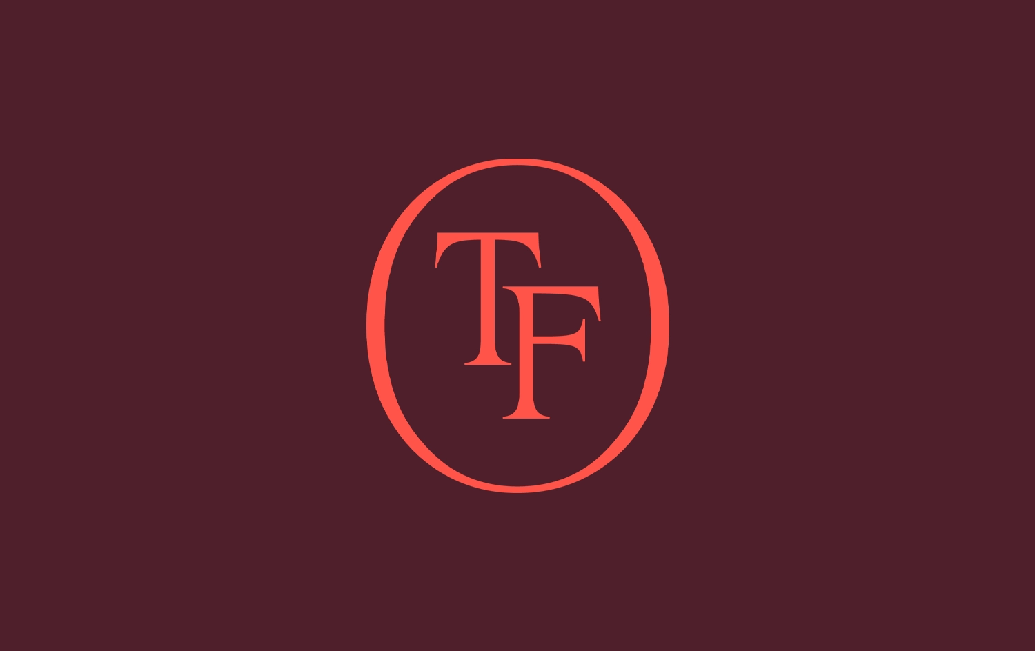
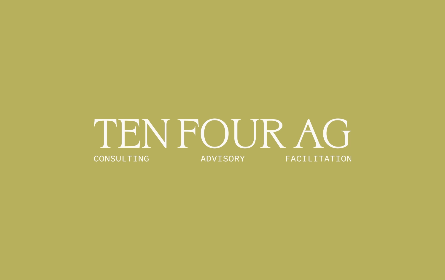
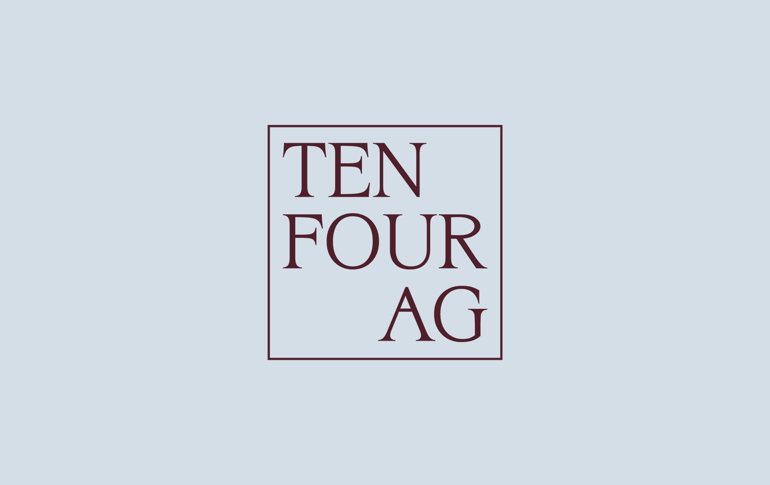
Pene needed a brand that could sit in a government meeting and hold up just as well pulling into a farm gate. Most agricultural branding picks one register and stays there, corporate or country, rarely both.
The obvious colours were already taken. Navy read too corporate. Terracotta read exactly as expected. Neither said anything true about the business.
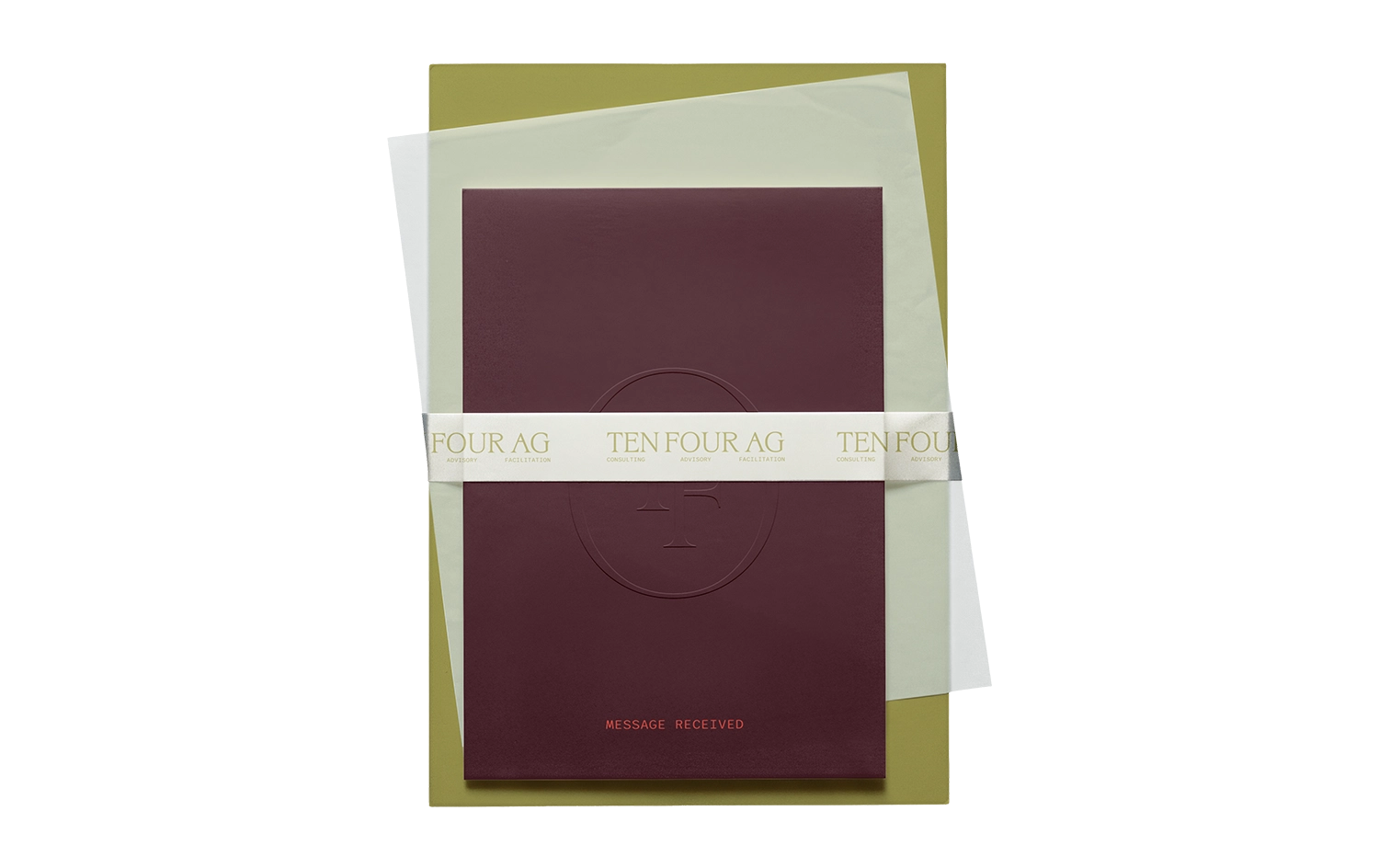
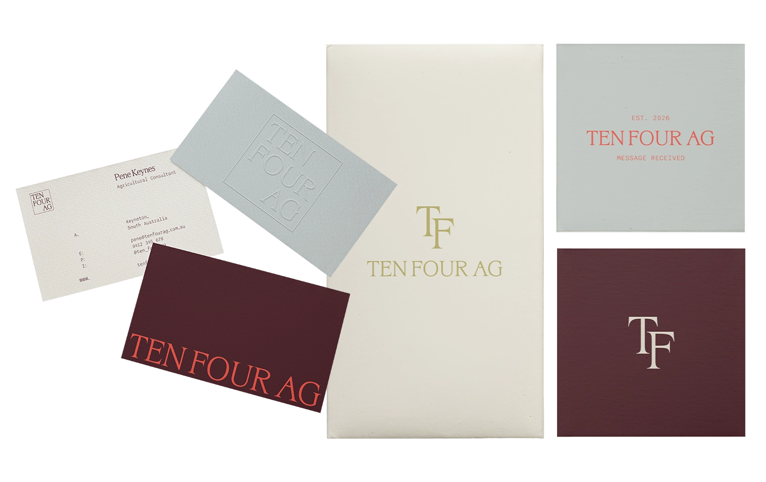
We built the identity around Night Bordeaux, a deep burgundy that reads considered rather than corporate, paired with a soft olive and a warm neutral base. Nothing about it looks like typical ag branding, and that was the point.
A serif wordmark carries the weight. No icon, no gimmick, just type confident enough to stand on its own, on a business card, a report cover, or a website header.

Ten Four Ag now has a full identity system, logo suite, colour and type guidelines, and templates built for how Pene actually works, government reports one day, property visits the next.
It reads as serious wherever it shows up, without losing the plain-spoken register underneath it.
"Working with Bridget was an absolute pleasure, she was responsive and thoughtful in her designs and alignment with my vision.
So pleased with what we have ended up with and her support throughout the process.
Definitely worth the investment and would highly recommend her to anyone needing branding done for their businesses."




Marketing for Rural Australia