Nick Ormsby started Northern Hedging and Contracting in 2009 with one machine, a 44 gallon drum of diesel, and an arrangement with his first clients: fund the fuel and we'll get started. He'd come north from the Riverland when the drought hit, not looking to build anything in particular, just looking for work.
Fifteen years on, that's two specialist contracting businesses. NHAC in horticulture and forestry, NT Broadacre in cotton and broadacre cropping, servicing farmers, investors and landholders across a 550km radius out of Katherine.
Both businesses were known by name to the people who hired them. What didn't exist was a parent brand that could speak for them in the rooms they couldn't get into themselves.
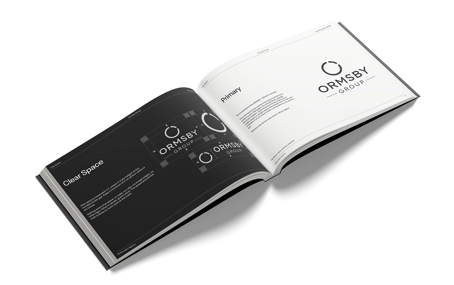
Northern Hedging and Contracting and NT Broadacre had each earned their own recognition over fifteen years of work. The problem was everything happening away from the paddock, corporate conversations, recruitment, investor and landholder relationships, and the simple absence of one digital front door.
A parent brand had to exist for those contexts without taking anything away from the two names already doing the work. Build it too loud and it competes with its own businesses.
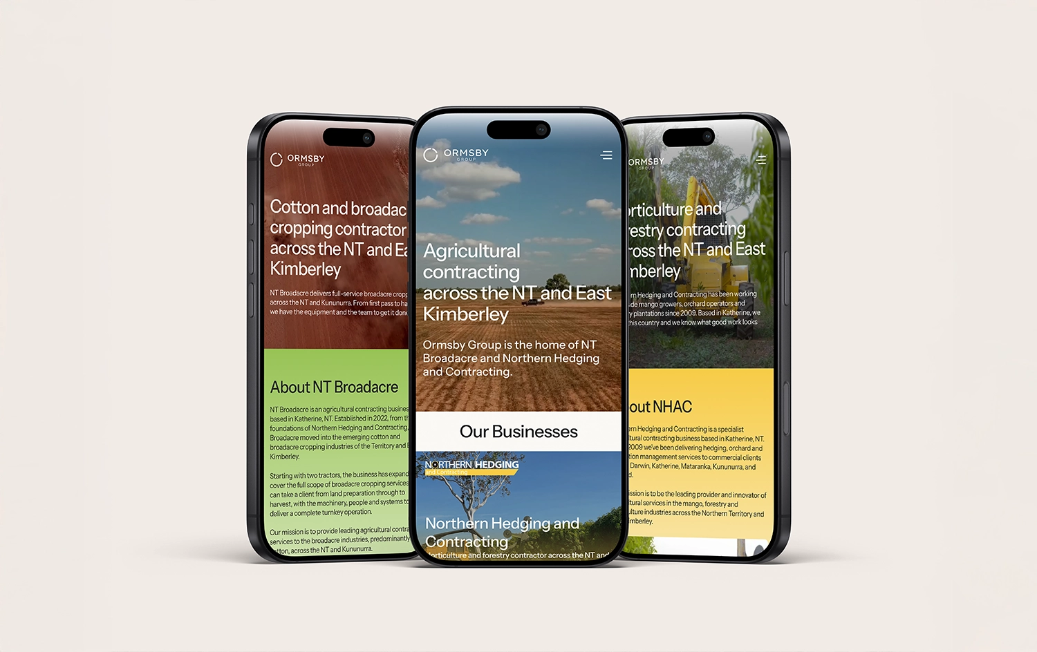
The whole system runs on restraint. NTB owns green, NHAC owns yellow, so Ormsby Group took no accent colour at all, just charcoal and cream. No tagline on the wordmark. No place on the work shirt.
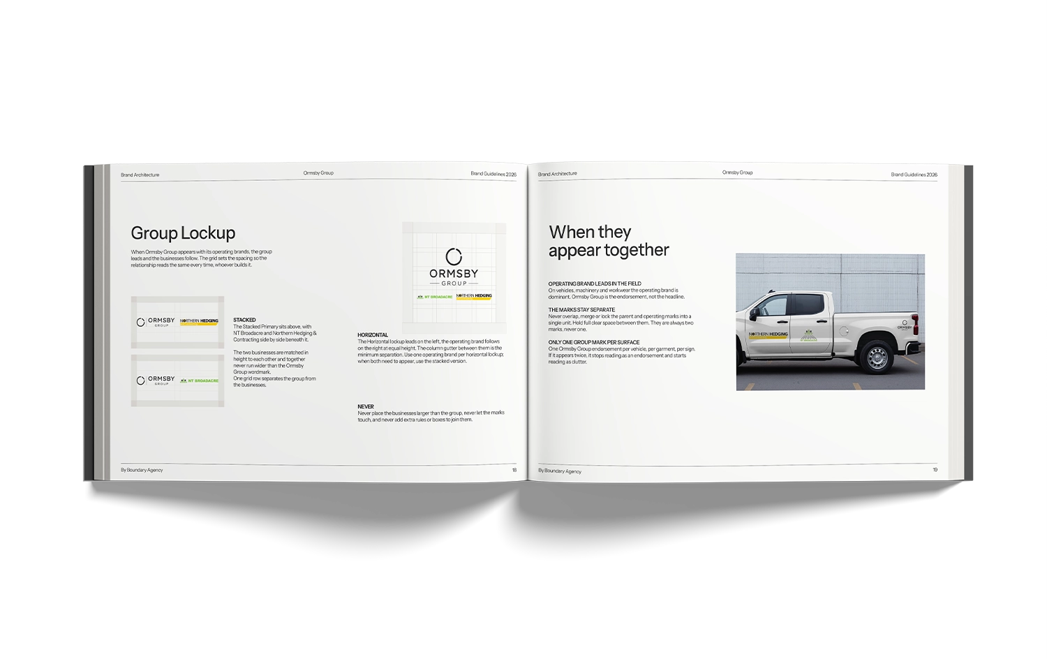
One rule governs the architecture: the group leads in corporate and recruitment spaces, the operating brands lead in the field. That gets tangible in the apparel spec, work shirts carry the business only, caps carry the business on the front and Ormsby Group small on the back mesh, and field day wear flips to the group because at a stand the crew represents everything at once.
Then the copy and the build, written and made to the same standard. Plain, industry literate, no corporate fluff. The site says "Need a contractor?" rather than "Ready to get started?", which tells you the register in four words.
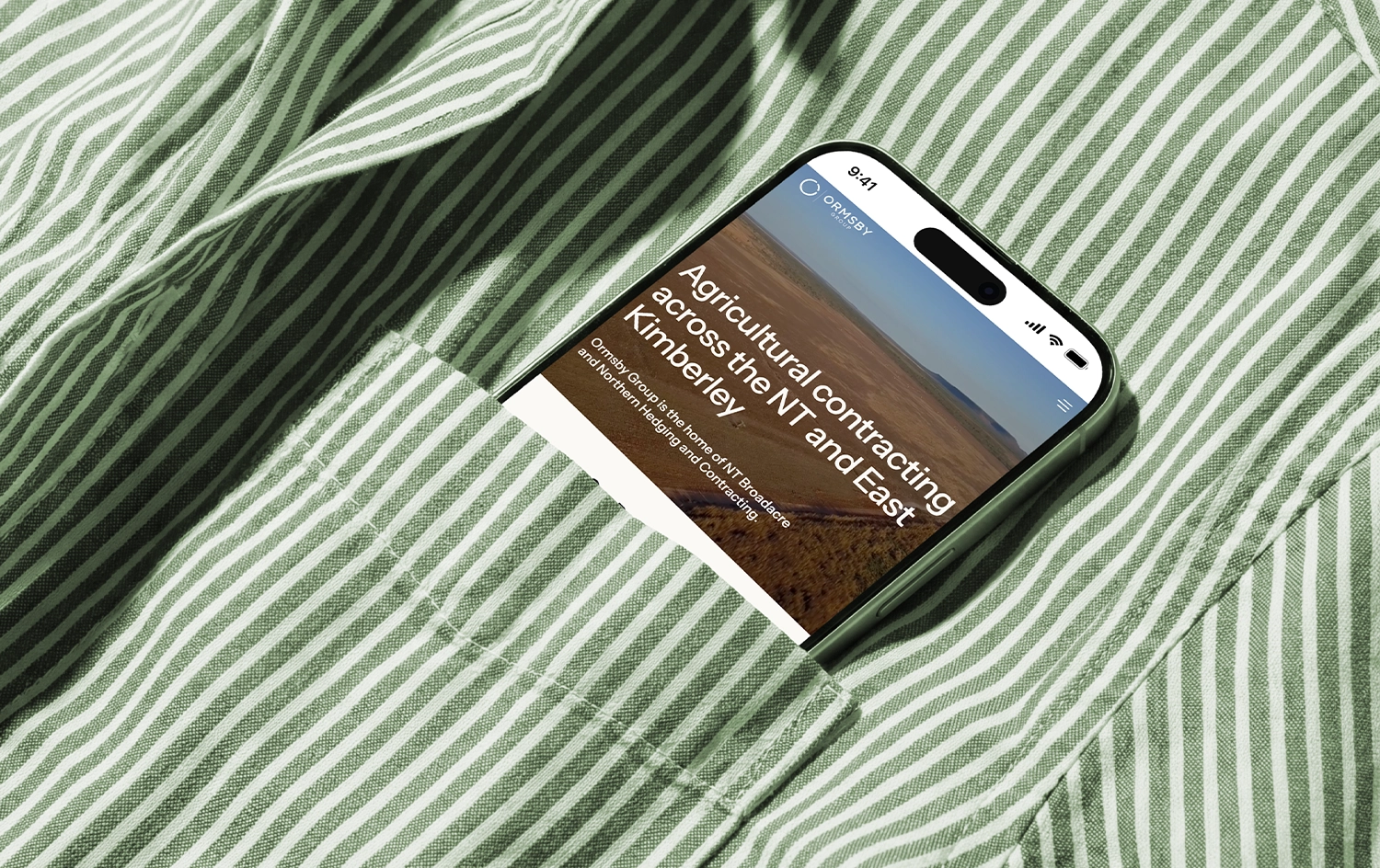
A 36 page guidelines document, a five configuration logo suite, and a Webflow site where the architecture is visible in the interface itself, cream and charcoal holding the chrome while each business takes over its own colour once you're inside its territory.
Eleven CMS driven service pages, a shared recruitment collection across both businesses, and enquiry routing that sends the right job to the right company from the first form field. The old domains now redirect into the group site, so fifteen years of accumulated recognition funnels somewhere useful instead of being stranded.
CMS help text was written into every collection too, so Nick and Whitney can keep adding content without the tone or the structure coming apart.




Marketing for Rural Australia