



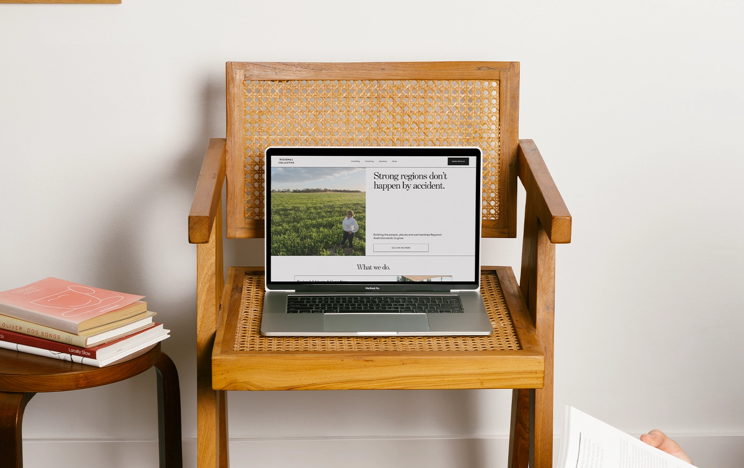
Regional Collective is three businesses under one name, consulting, coworking, and speaking, and none of them wanted to sit in the same room. The site had to hold its own next to government logos and industry partners, and still sound exactly like Sarah once you got close enough to read it.
The brief was simple to say and harder to build: neutral enough to belong anywhere, distinct enough that you always know which part of the business you're in.
Consulting deals with governance and organisations in trouble, it needed to feel authoritative. Coworking needed to feel like somewhere you'd actually want to spend the day. Speaking is where Sarah's personality is the whole product.
Treat them too similarly and everything flattens out. Let them drift too far apart and the brand comes apart with them.
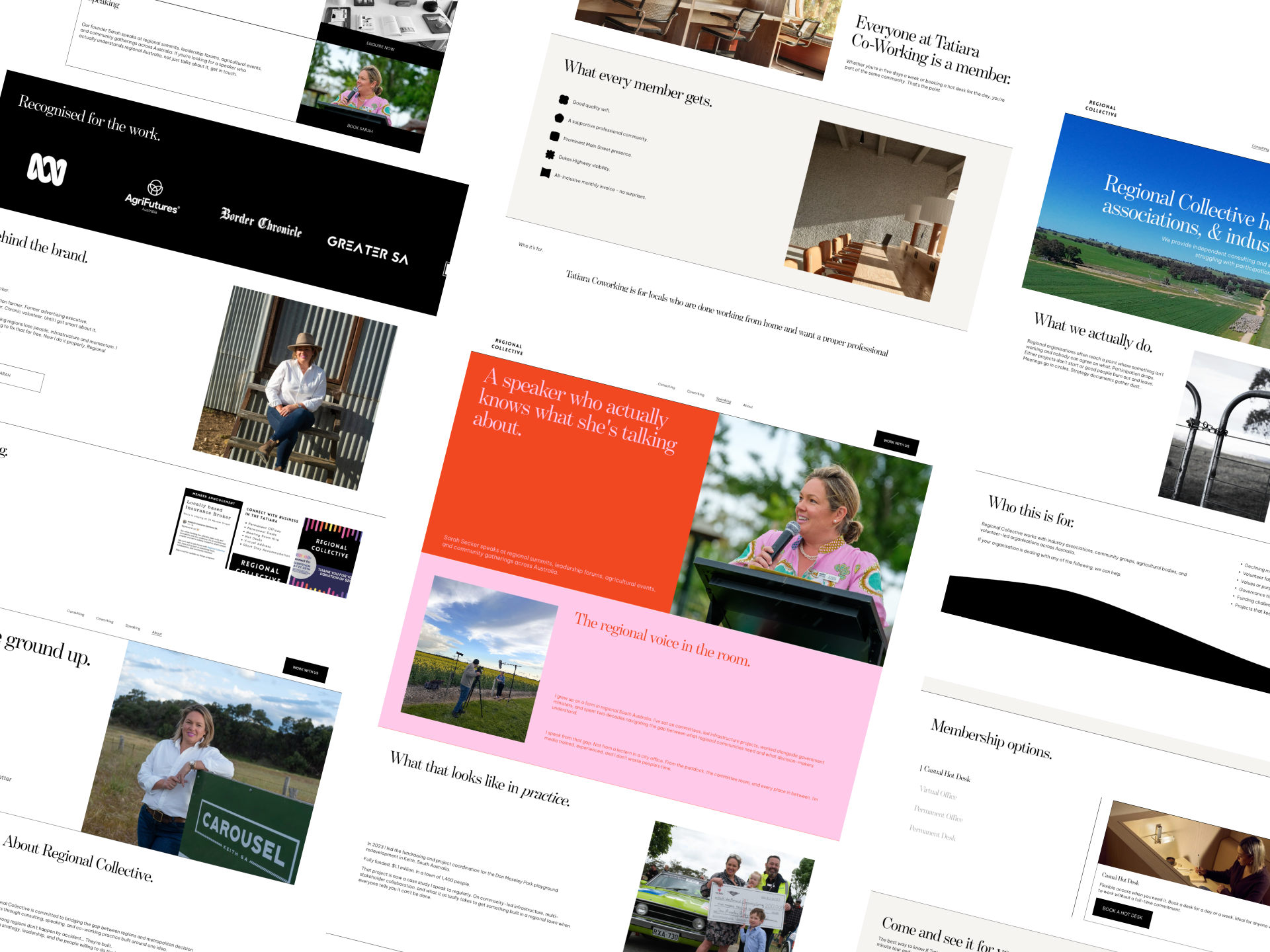
A black and white base holds everywhere the brand needs to sit alongside someone else's logo without a fight. From there, each service area gets its own register, consulting stays dark and considered, coworking warms up, speaking runs full colour.
Copy was written in Sarah's actual voice, direct, no hedging, no filler. If it could be said in five words, it was said in five words.
Regional Collective now runs on Squarespace so Sarah can manage it herself, with social proof, an email capture, and a contact form that triages enquiries by service from the first field.
Three businesses, one brand, and nobody has to ask which one they're looking at.
"When I went to Bridget I had a vague idea for a startup co-working space for our small country town. She did the end to end design, copywriting and build and I couldn’t be happier.
She was fantastic at pinning me down but also taking the ‘bull by the horns’ when she needed to.
She really understands country life and what the site needed to do which made the process very stream lined. I look forward to working with Bridget as this new business grows. "




Marketing for Rural Australia